
Sep 2022 - Mar 2023
UX/UI Designer
Cafe Clover is a coffeehouse in the Greater Philadelphia area that specializes in authentic Korean desserts. It's a great space to catch up with friends over dessert and beverages. Although Cafe Clover has a cozy ambience and a menu full of tasty items, its website is lacking in some areas and doesn't represent the cafe to its fullest extent.
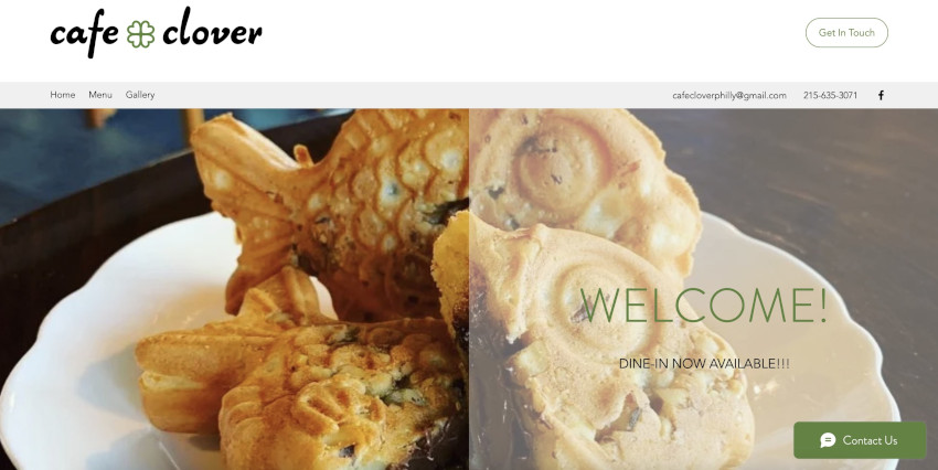
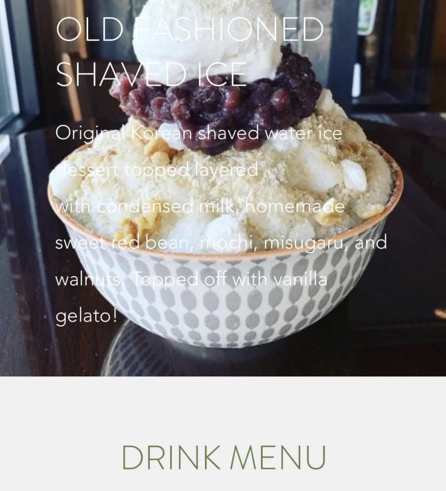
One of the main issues about this site is the structure of the menu; there is no hierachy to distinguish between the item and the description and no prices listed. The formatting of the menu between the desserts and drinks are different, creating inconsistencies. There are also no prices listed, making it difficult for people to see ahead of time what they are paying if they preorder.
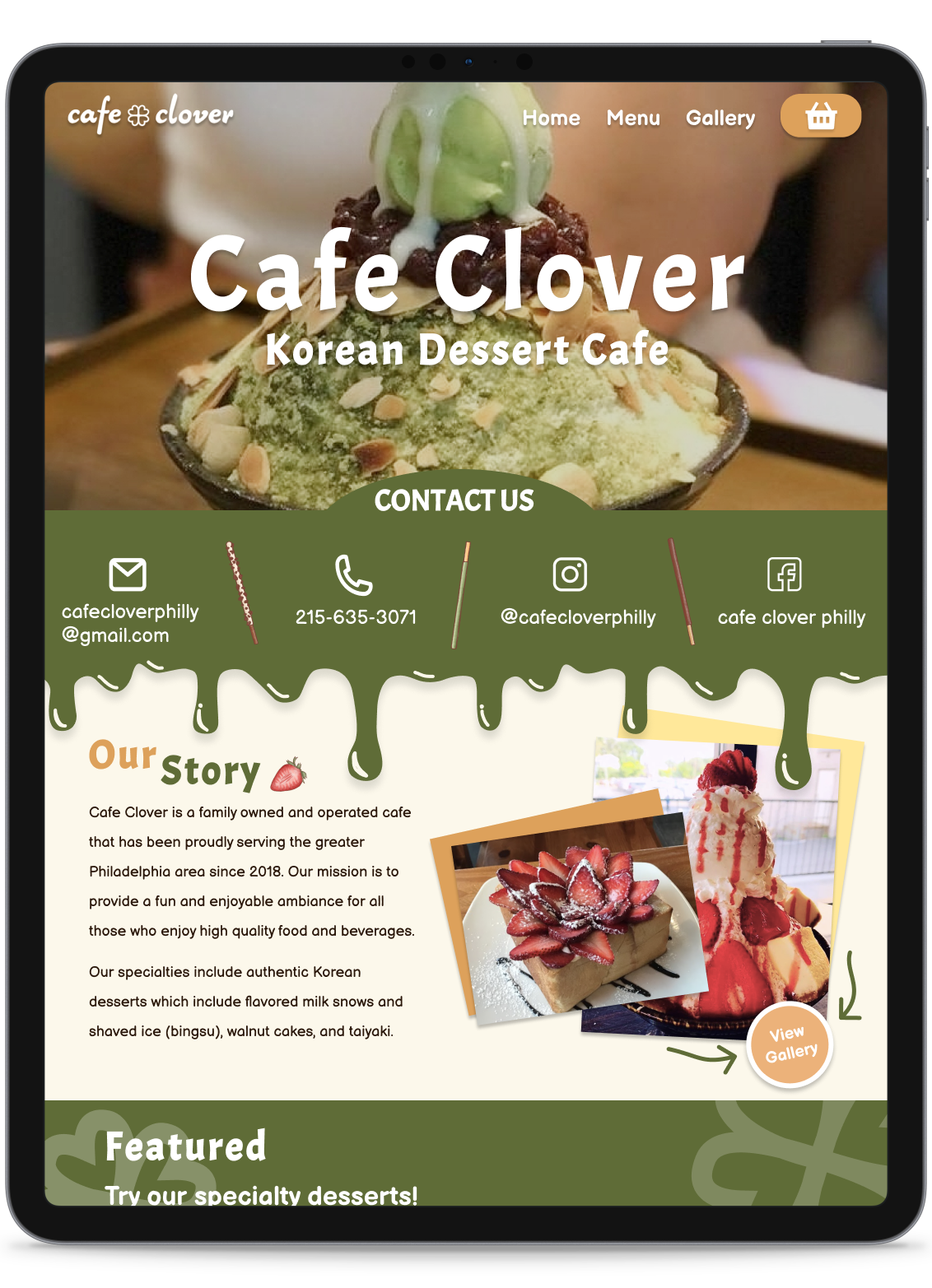
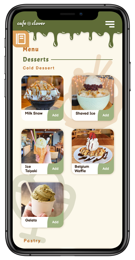
Additionally, the mobile site is unresponsive, making it hard to read text. All of the text that is placed next to photos end up on top instead. In today's age, a lot of people browse on their phone, so having a functional mobile site is crucial if a business wants to communicate their information.
I conducted a card sort exercise to gauge how users would organize specific items. This was especially geared towards the menu items since I wanted to add a filtering system that could organize items in a way that made sense to users. For the cards, I listed down features of the website and specific menu items. Then, I listed categories I thought would be suitable to group the menu items. I tasked college students who enjoy trying new desserts/drinks or frequent cafes to take this exercise. Participants were to sort the cards into categories, but they were also allowed to make their own categories.
Some information I received from the card sort exercise:
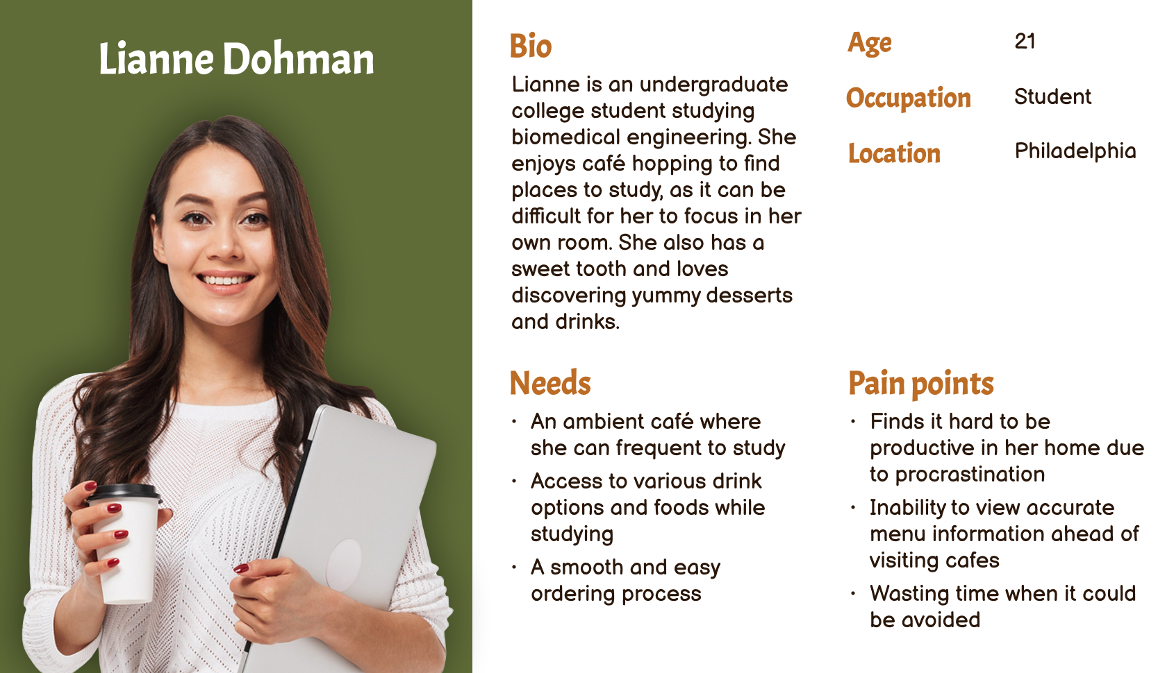
To gain a better perspective of the audience I am designing for, I put together a user persona of someone who may typically frequent Cafe Clover.

Add a filtering system to the menu so that people can find specific menu items easily instead of scrolling through an extensive menu. Also, add prices so customers know what they are paying when they preorder or visit in person.

Make a cohesive site design that is consistent throughout each page

Implement online ordering for quick, easy preordering when people are on the go.

Highlight the cafe's qualitites through customer reviews and gallery photos.
Based on the card sort exercise, I was able to construct a new sitemap that organized the menu items into specific categories. I kept the general structure of the original sitemap but organized the contents to be more detailed.

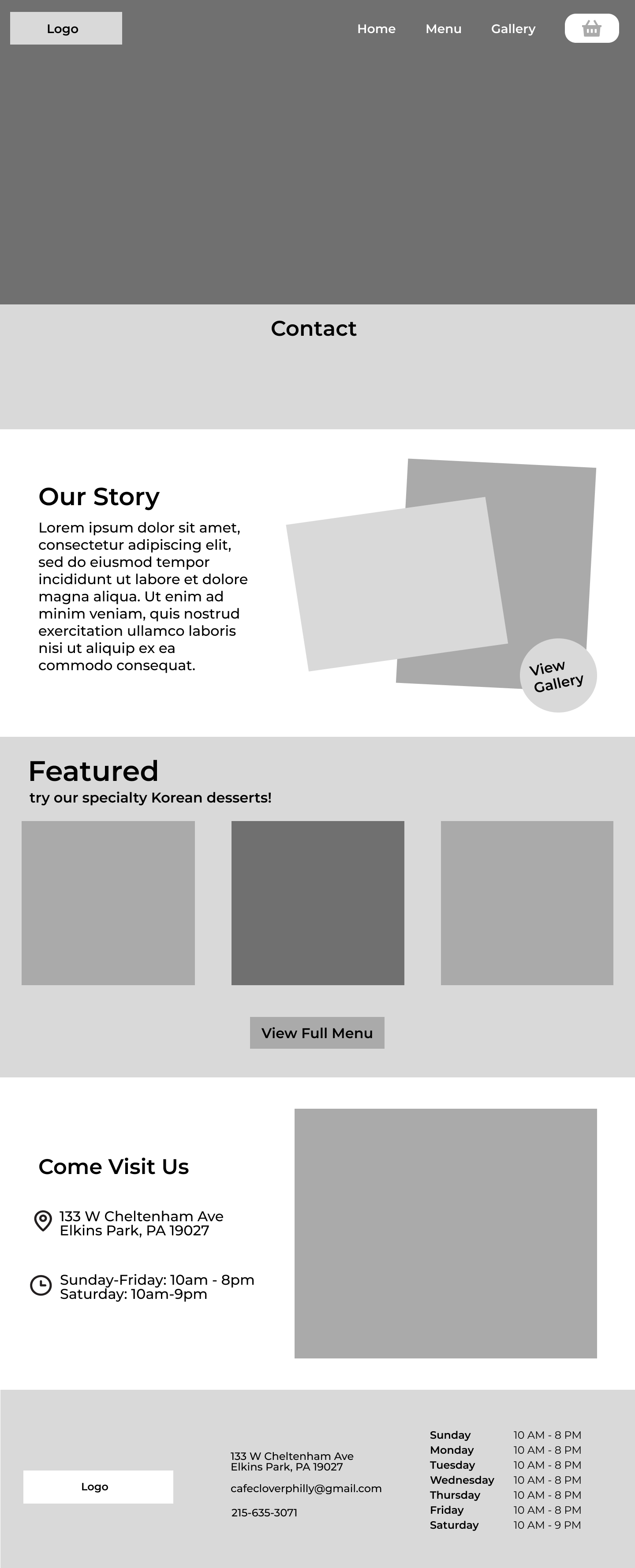
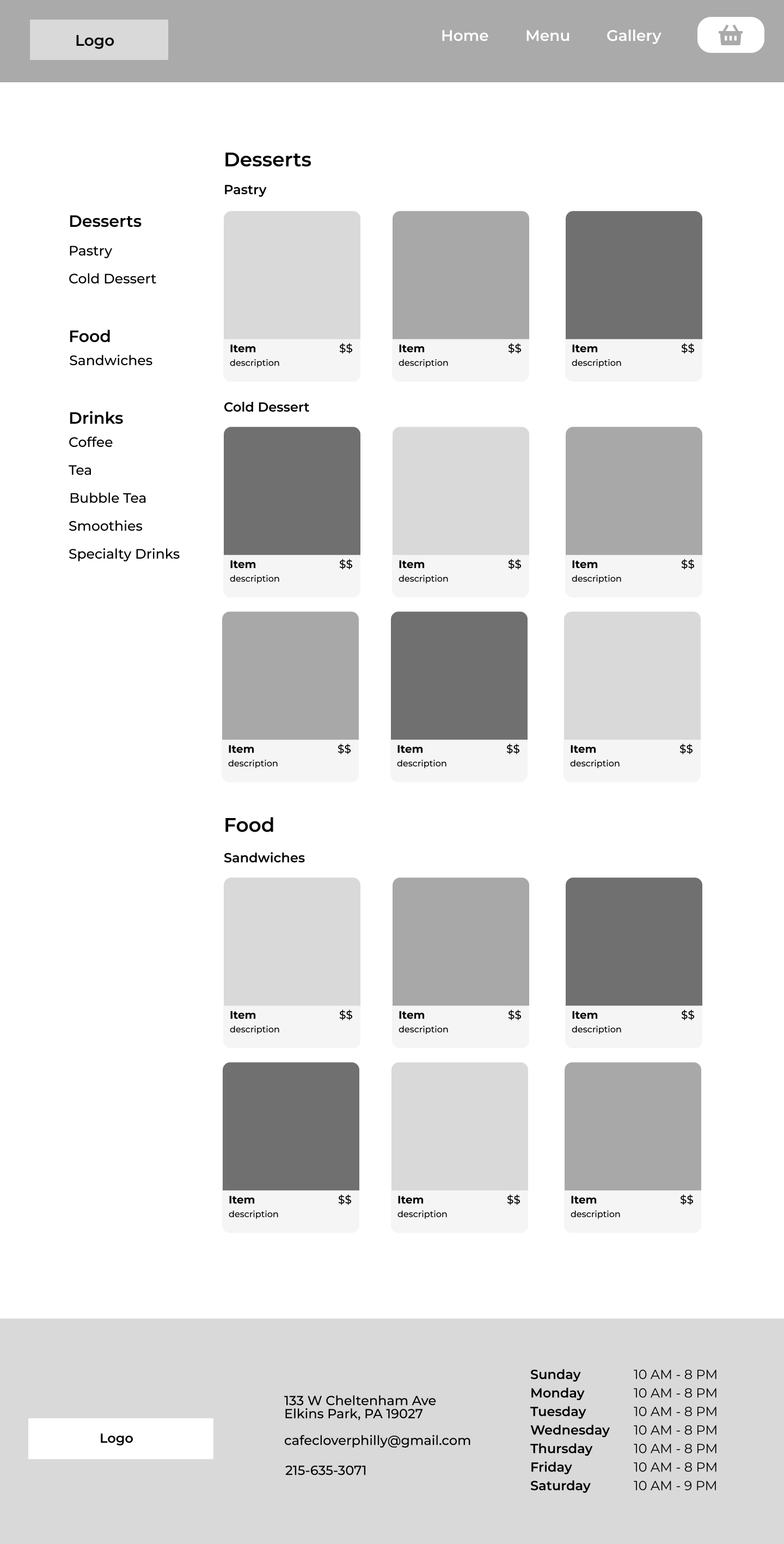
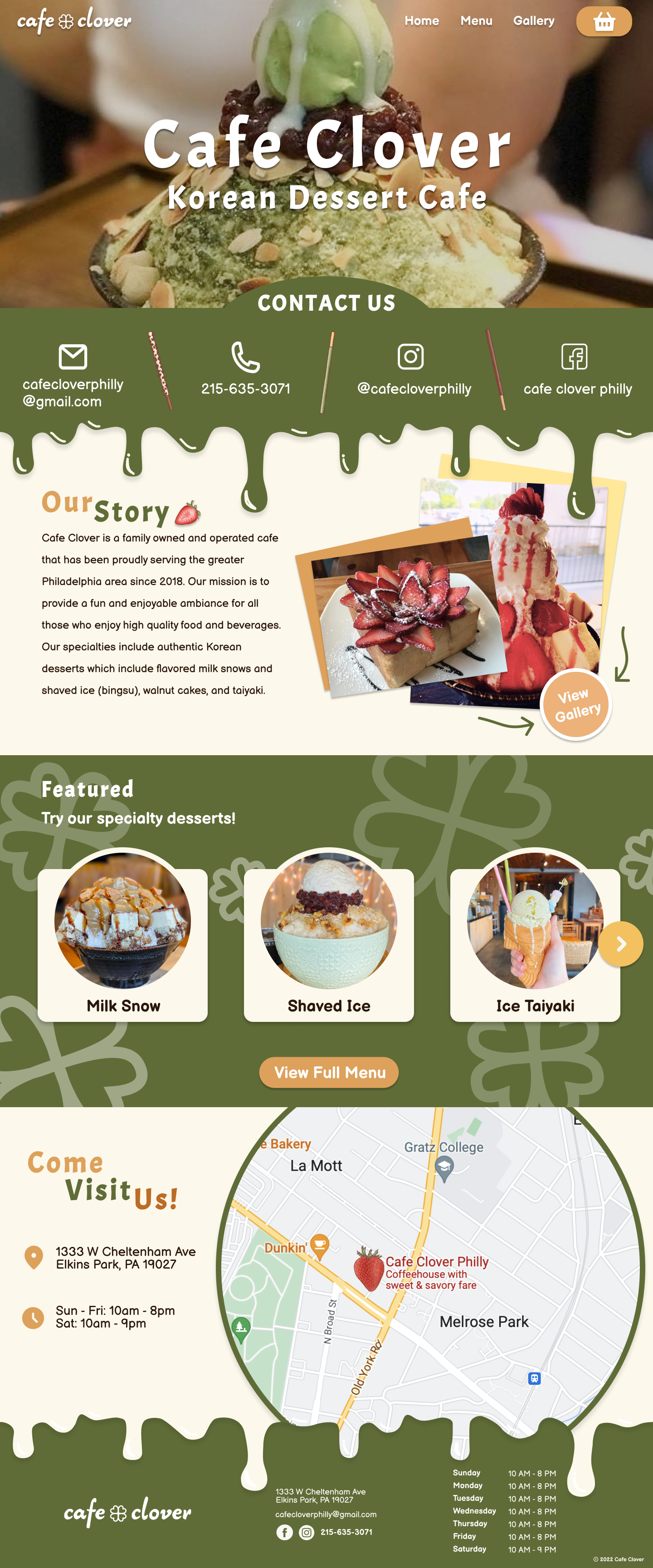
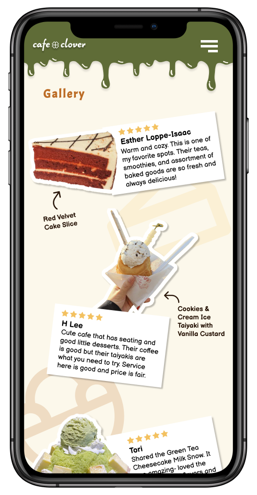
When brainstorming the initial layout of the cafe's website, I created these wireframes. The featured section on the homepage displays Cafe Clover's main menu items, which are the Korean desserts. I wanted to implement a filtering system in the menu that allowed users to click on a specific category and have the page scroll down to that section. For the gallery page, I incorporated reviews to help users learn more about which items to try out.
To stay true to Cafe Clover's branding, I wanted to keep green as the primary color. I also incorporated beiges and warm colors reminiscent of dessert colors to add a pop of color to the site.
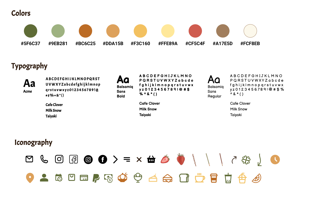
For the final design, I strove for a playful visual aesthetic that highlighted Cafe Clover's main delicacies: desserts. The drip borders mimic frosting or syrup, and I incorporated some hand-drawn iconography and doodles
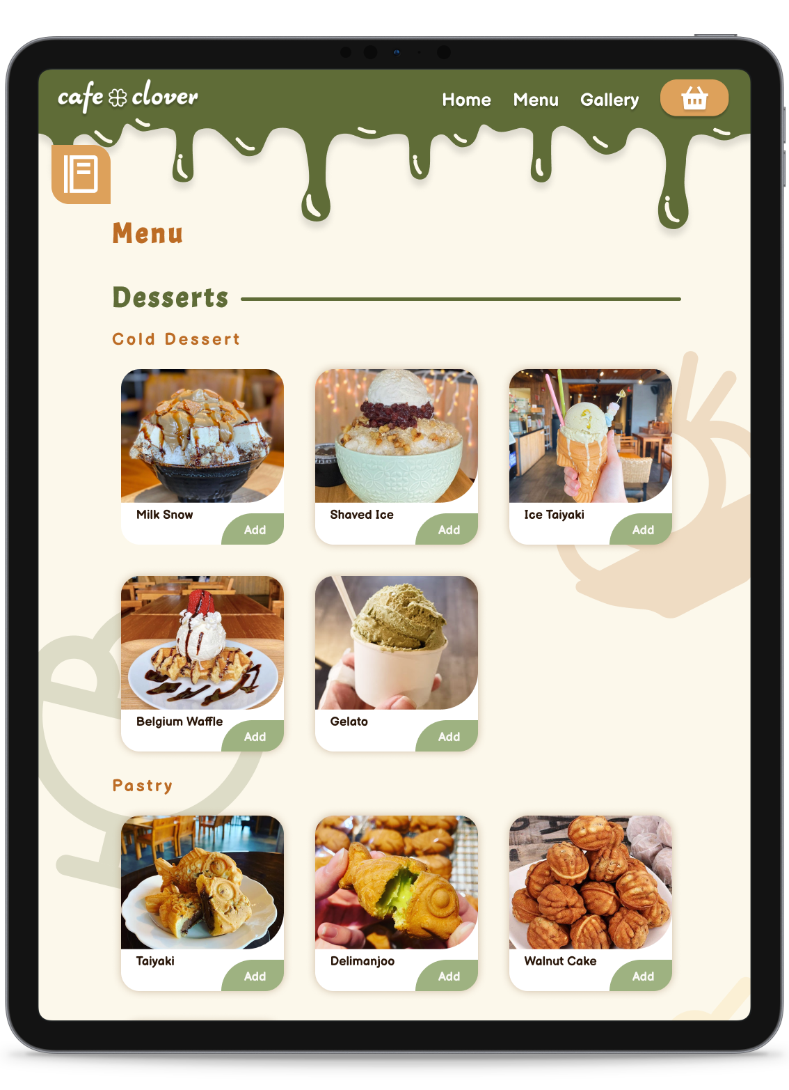
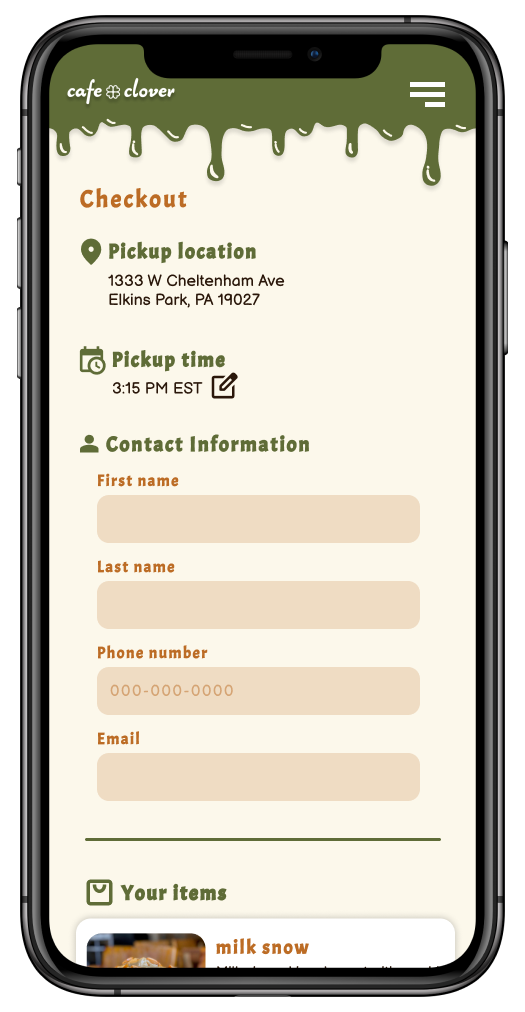
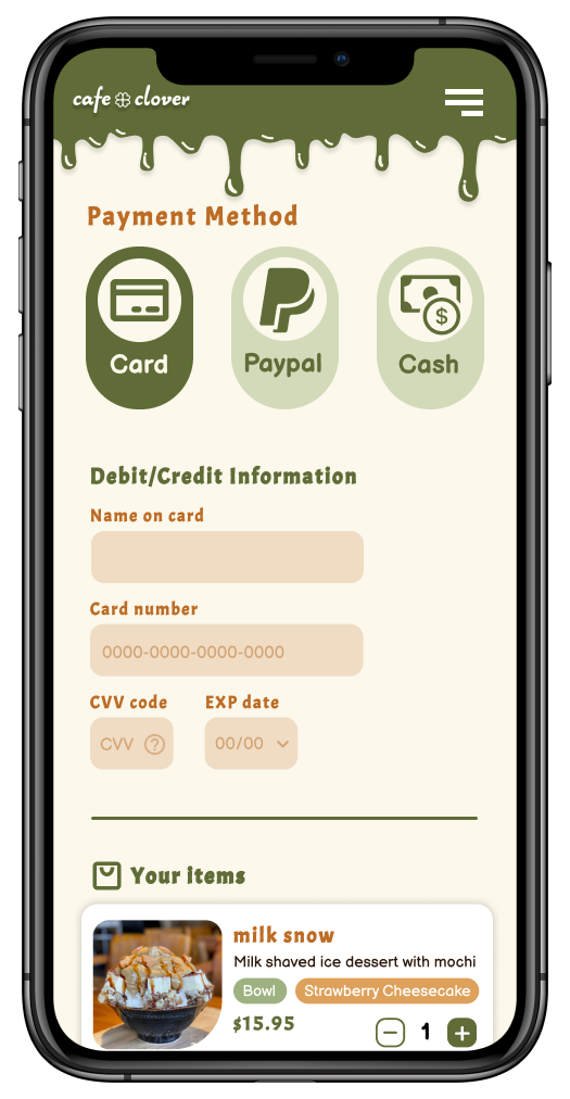
The menu and order system are the biggest changes to the website. Previously, the menu had no hierarchy nor images and prices for each item. Now each item has their image, and clicking “Add” will pop up a modal that allows users to customize that item and add to bag. Clicking the orange menu icon on the top left brings up a filter that jumps to each section when clicked on.
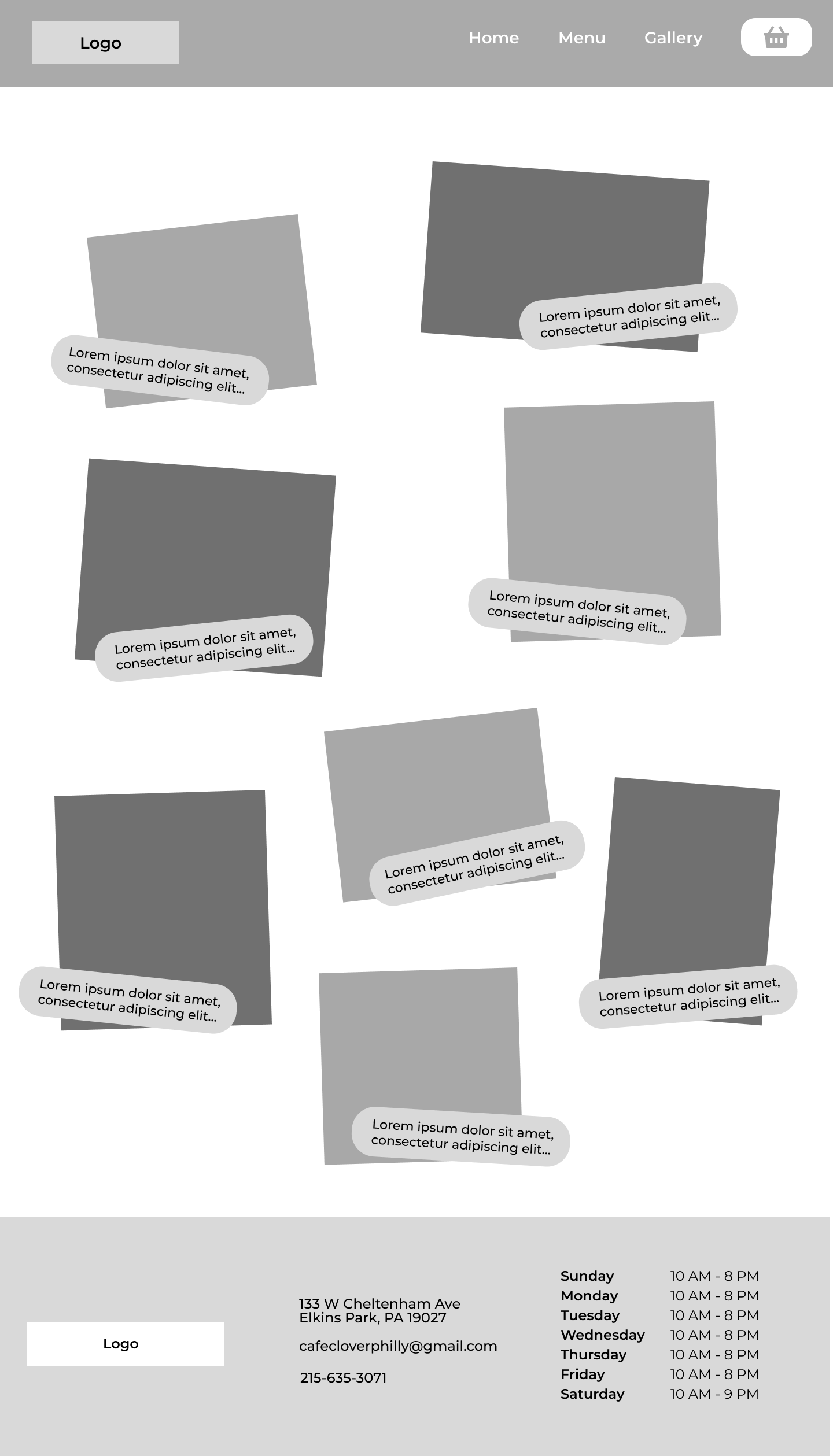
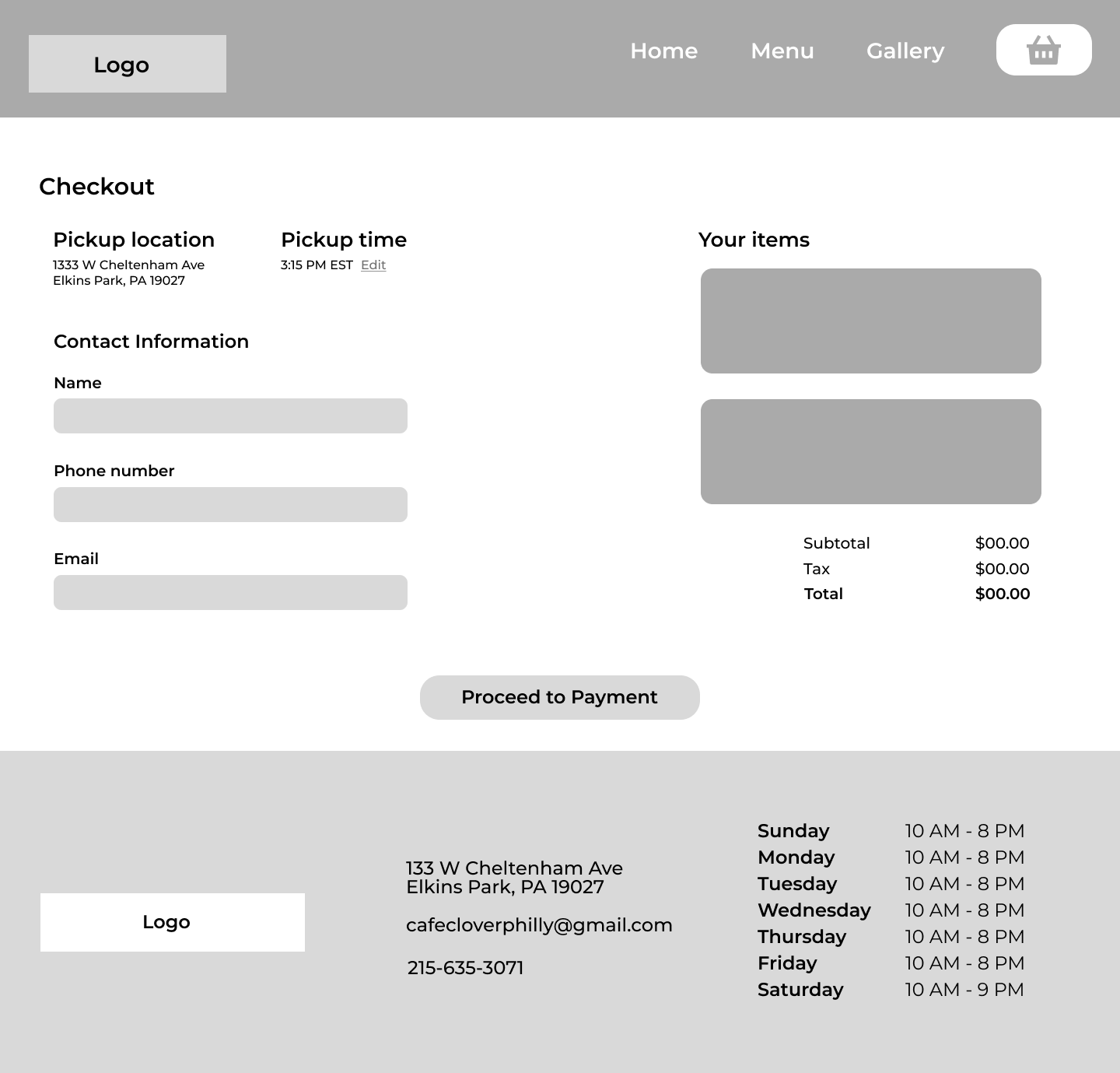
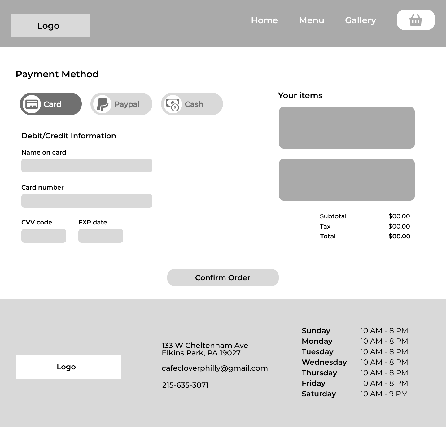
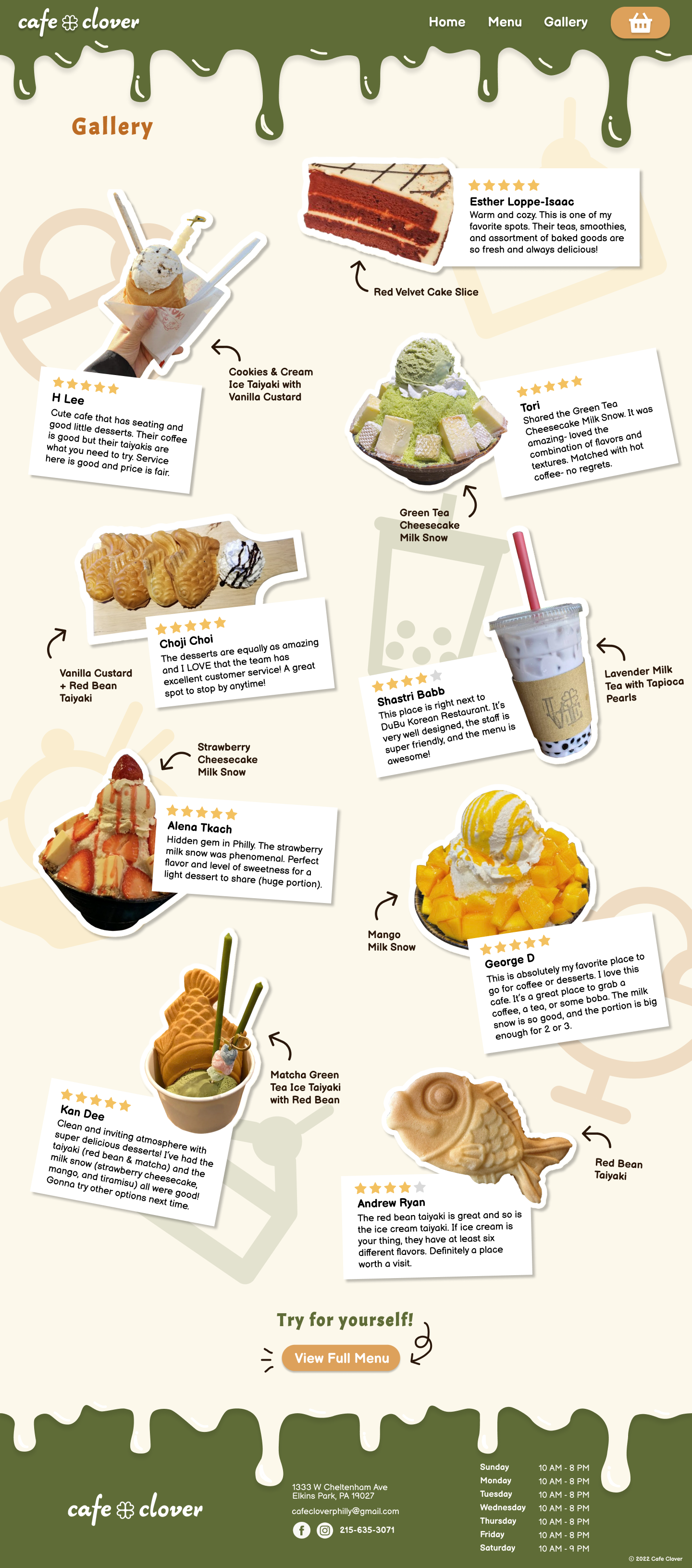
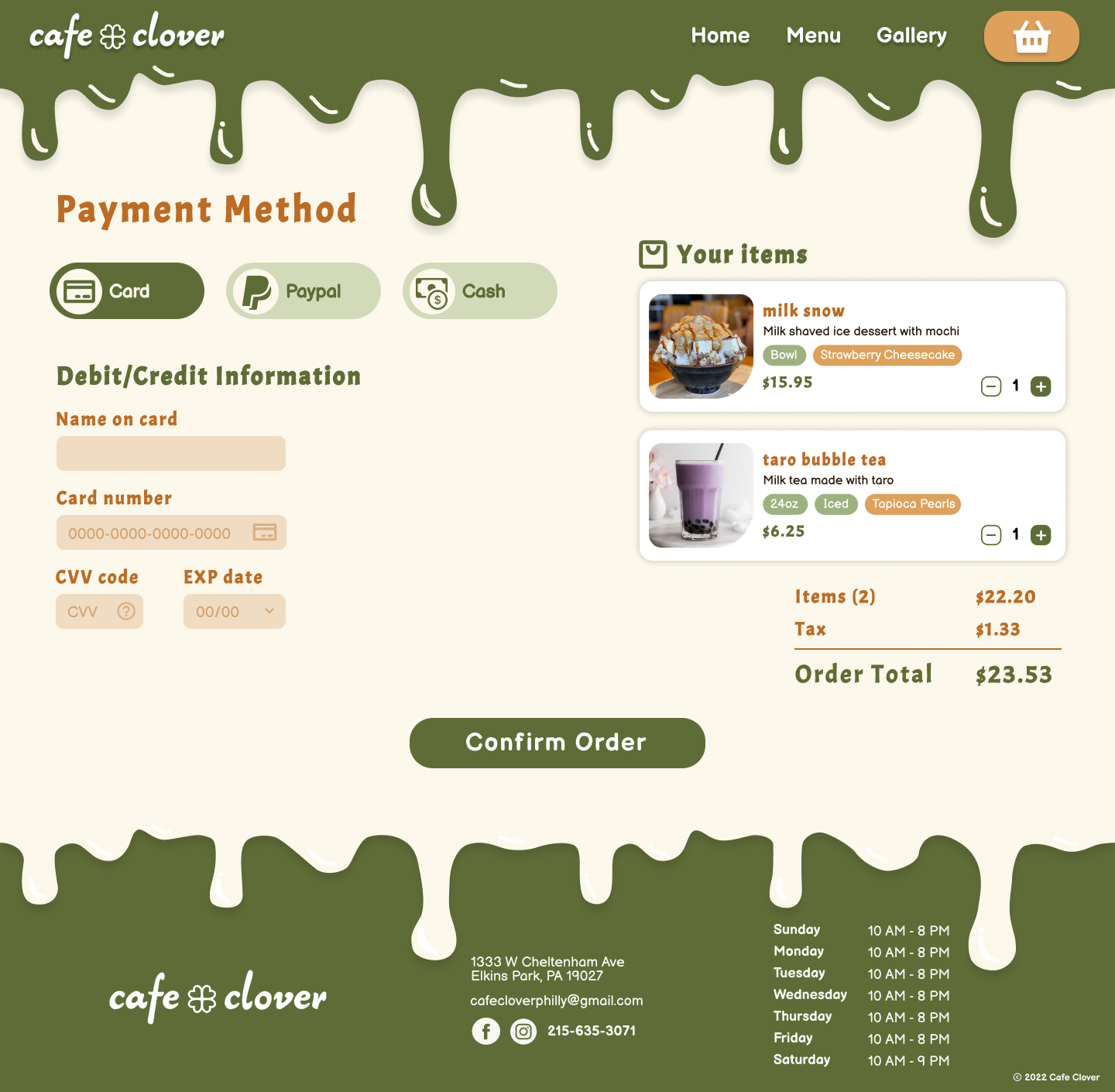
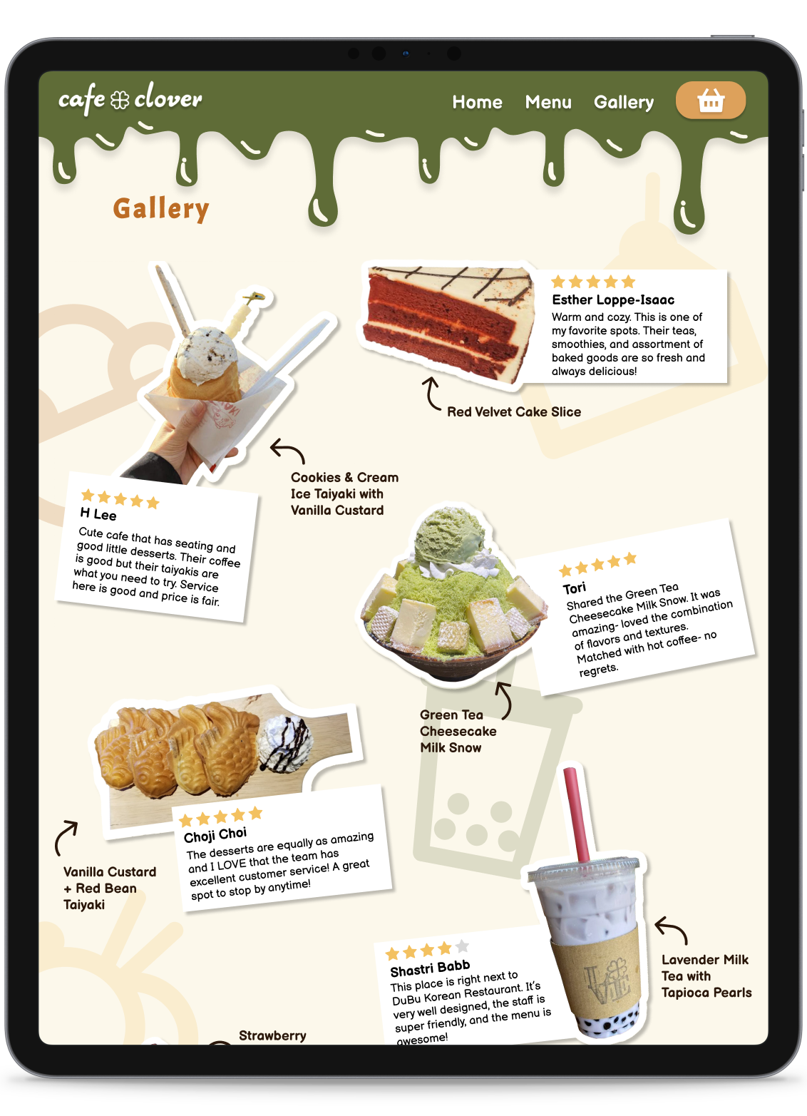
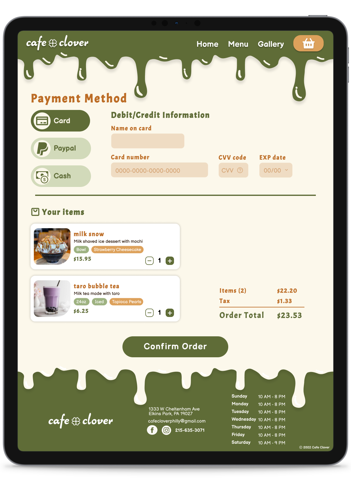
For the gallery, I decided to play around with the look of stickers to compliment the doodle aesthetic. Each review is grouped with images of the dessert item that it mentioned, along with the name/flavor of it. Finally, the checkout flow is streamlined to be straightforward, while still offering the user various methods of payment (card, Paypal, paying cash in person for pickup).


This video takes us through a flow of a user exploring the site and ordering items.
Links to the Figma prototypes if you want to play around!
This project was my introduction to Figma, so I was able to learn a lot of technical skills regarding designing and prototyping screens. I had a lot of fun customizing various animations and creating a user flow that was smooth and enjoyable to experience. This entire design process also taught me valuable UX skills such as wireframing, creating user personas, researching, and prototyping. With continual reiterations and feedback from my professor and peers, I was able to address the main painipoints of the original website and create strong branding for the cafe.